Parliament’s official petition website (petition.parliament.uk) has gained considerable traction in recent years, bringing attention to wide-ranging issues. From 2010 to 2015, the most popular petition on the website received 328,000 signatures, with 39 more receiving over 100,000 signatures. In the 2017-2019 parliament, by contrast, the most popular petition received over 6 million signatures while 75 others received over 100,000 signatures. These petitions are a valuable source of data for measuring public opinion, especially since petition signatures are reported at the level of Westminster Parliamentary Constituencies.
As you might expect, there is significant variation between different constituencies. Some local petitions garner support in concentrated areas while many national issues have unevenly distributed signatures. These patterns can tell us about the nature of public opinion and interests.
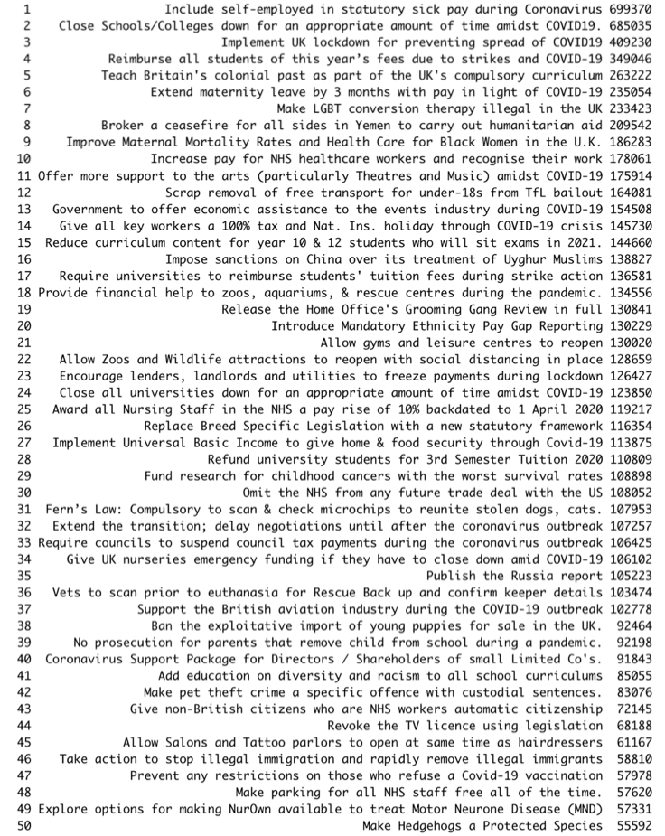
Clark, Lomax and Morris (2017) use this data to classify parliamentary constituencies into four groups: Domestic Liberals (N=110), International Liberals (115), Nostalgic Brits (276), and Rural Concerns (149). These groups are closely related to Brexit, with Domestic and International Liberals having high numbers of signatures for anti-Brexit petitions whilst Nostalgic Brits and Rural Concerns have relatively few. In 2020, a very different set of petitions are popular (in a very different political climate). I though it would be interesting to see how constituencies cluster with the new set of petitions (since December 2019). These are the top 50 petitions of the 2019 parliament:
Using the K-means clustering algorithm* on the standardised petition data by constituency, we get four clusters based on the 50 petitions. These clusters are summarised below:
- Liberal Towns (N = 114)
- Typical constituencies: Birmingham Edgbaston, Wycombe, Croydon South
- Higher support for petitions concerning education (eg 2, 4, 15 and 39)
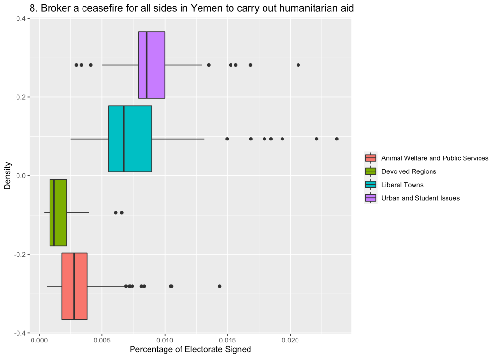
- Higher support for international issues such as Yemen and China (8 and 16)
- Lower support for animal welfare petitions (eg 26, 31, and 36)
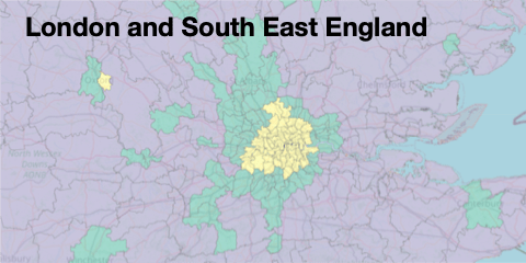
- Urban and Student Issues (N = 56)
- Typical constituencies: Putney, Manchester Withington, Hammersmith
- Much higher support for petitions relating to racism or ethnic minorities (eg 5, 9 and 20)
- More concern about economic impact of Coronavirus, especially on the arts (eg 11, 13 and 27)
- Lower support for animal welfare petitions
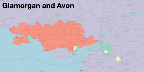
- Animal Welfare and Public Services (N = 386)
- Typical constituencies: Newark, Fareham, Fylde
- Much higher support for petitions relating to animal welfare
- Higher support for anti-immigrant petitions (eg 19, 46)
- Lower support for petitions relating to racism or education
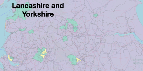
- Devolved Regions (N = 94)
- All constituencies in Northern Ireland, most in Scotland, many in Wales
- Lower support for most petitions but particularly those in devolved areas eg education
- Wolverhampton South East is an unexpected (and only English) member of this group, which may be because of lower engagement with the petitions website generally
You can explore the map of constituencies by their clusters here.

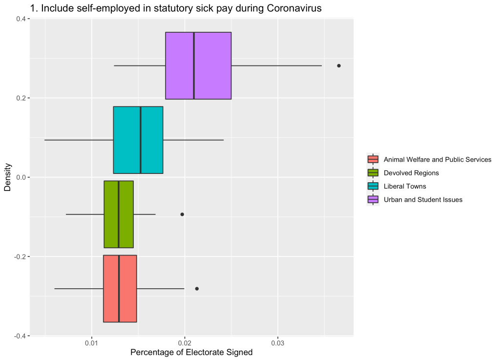
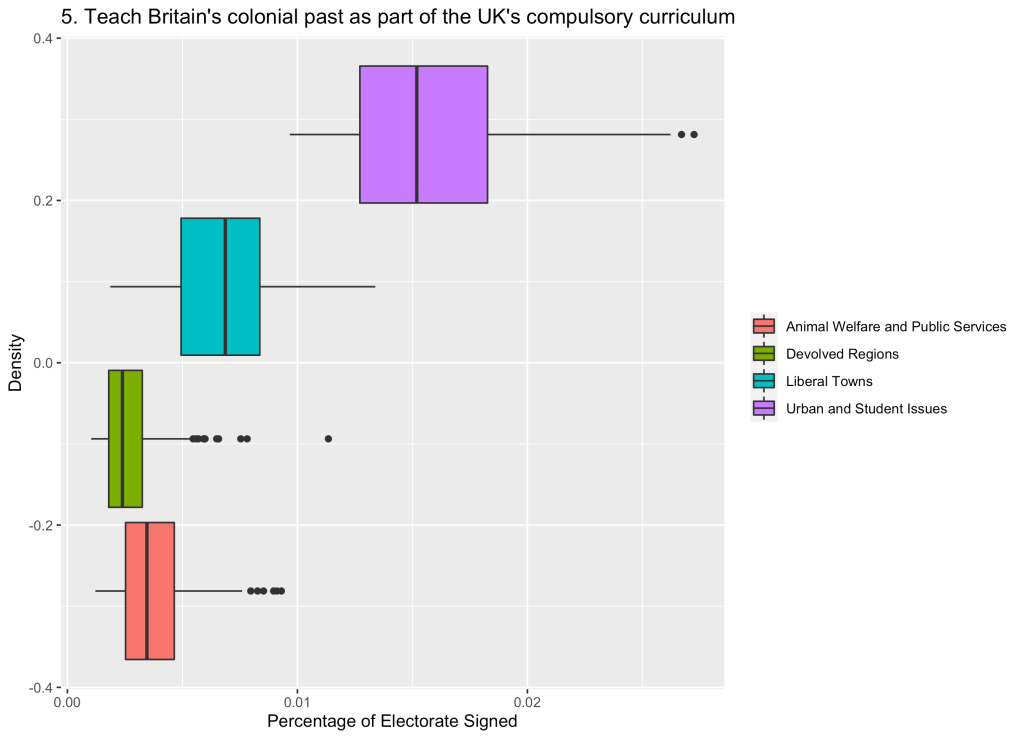
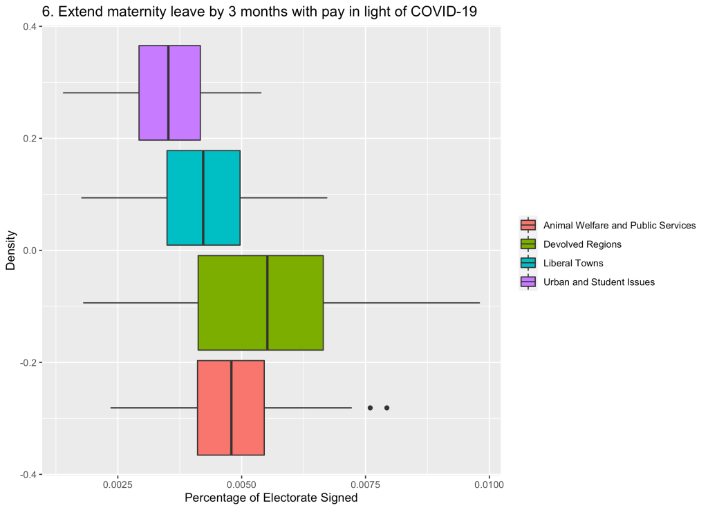
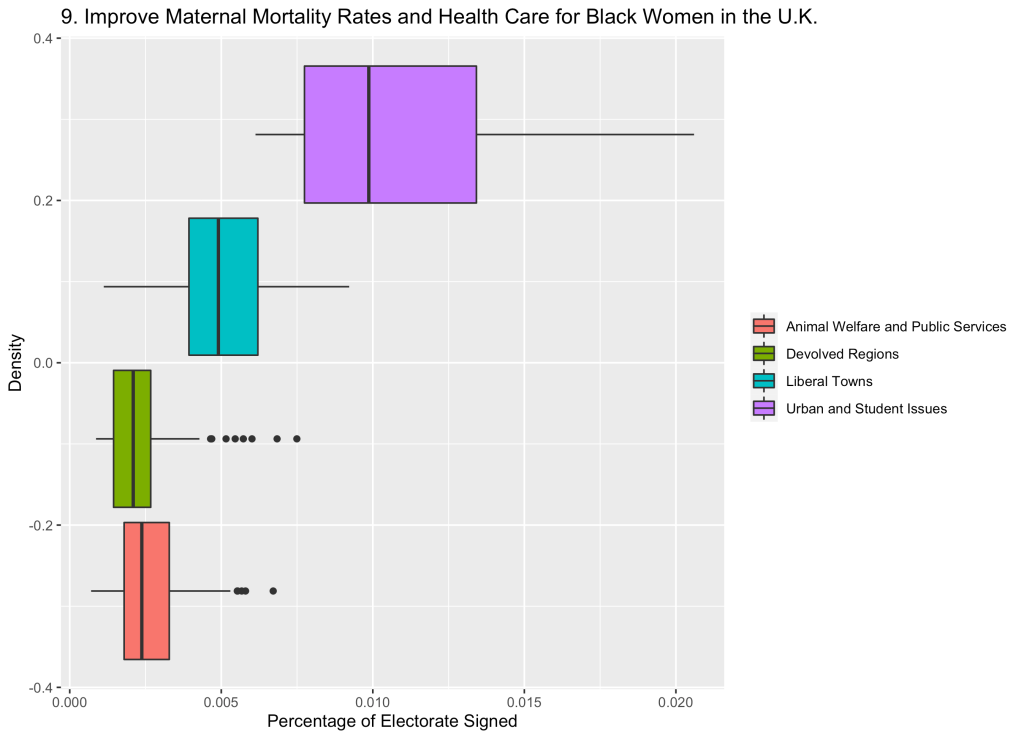
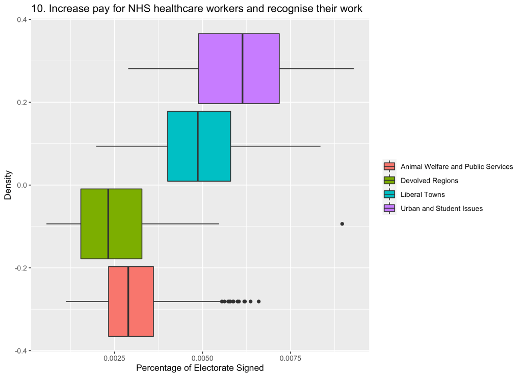
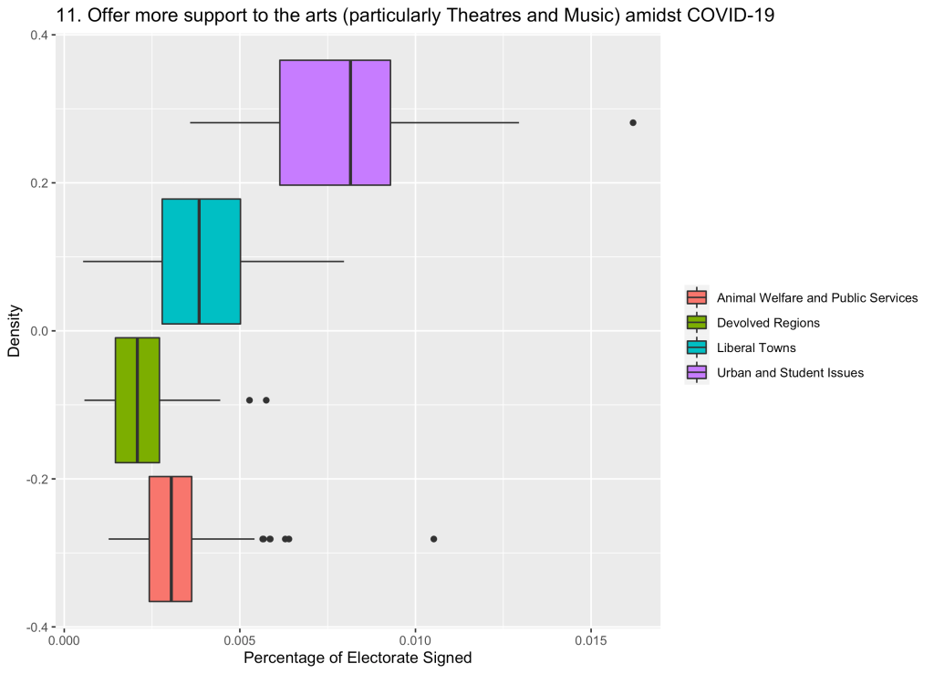
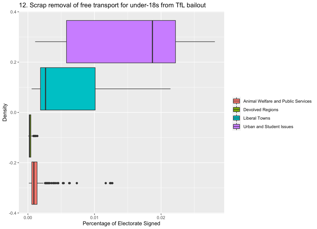
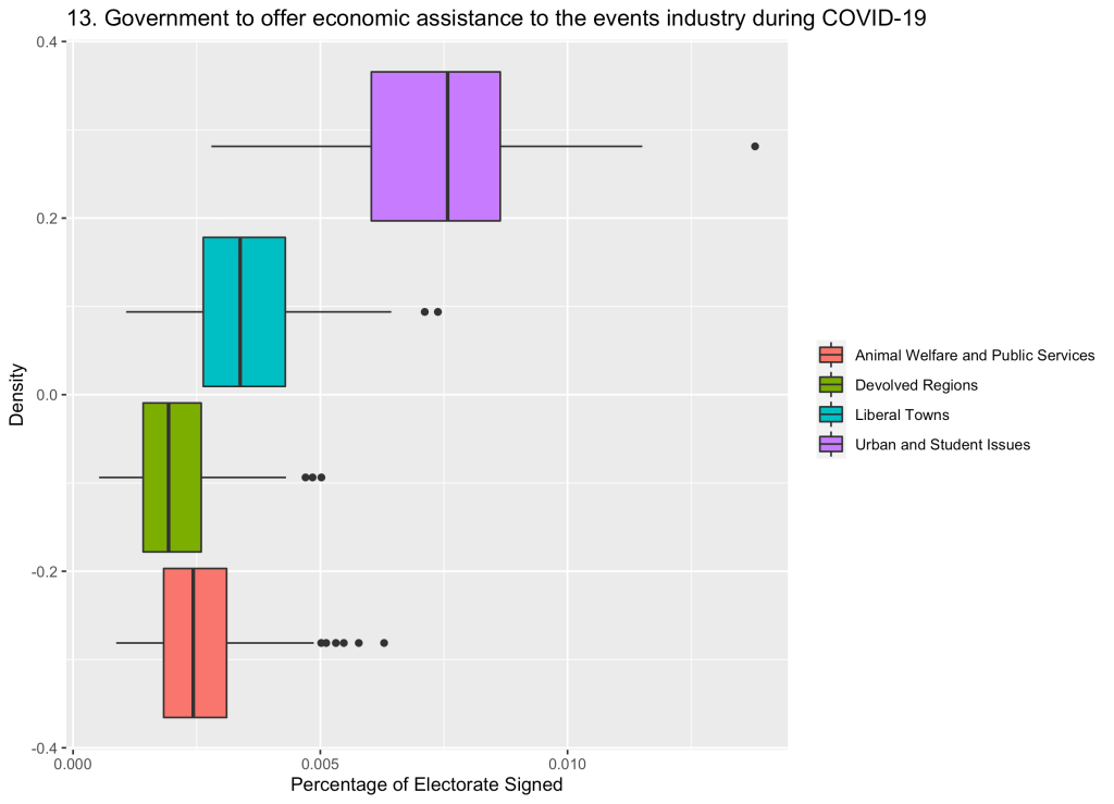
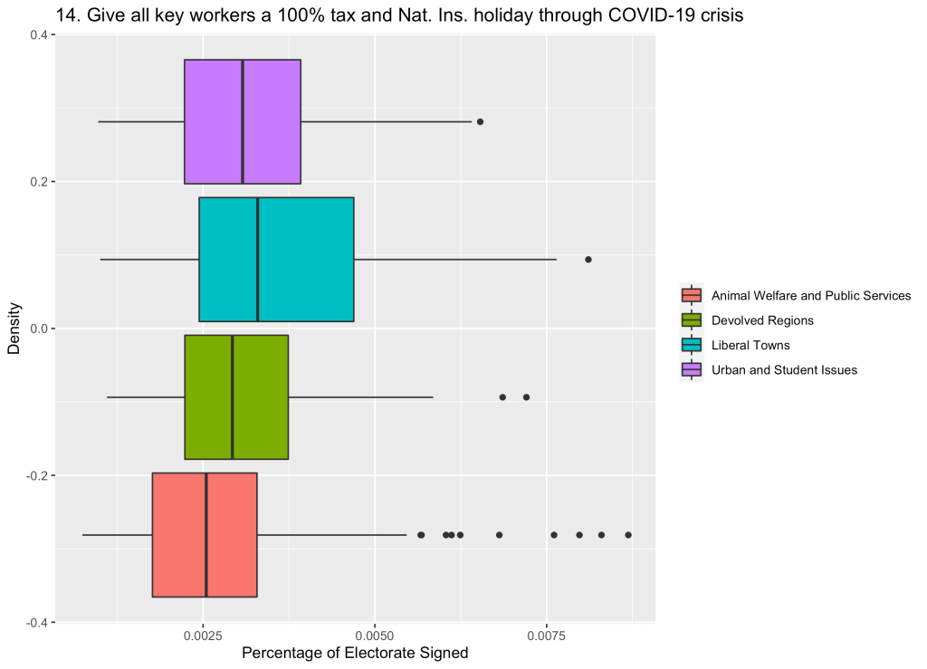
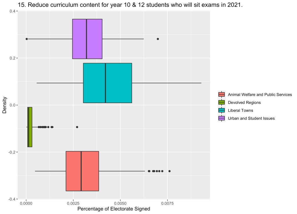
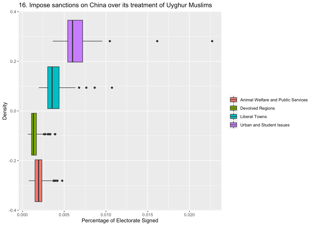
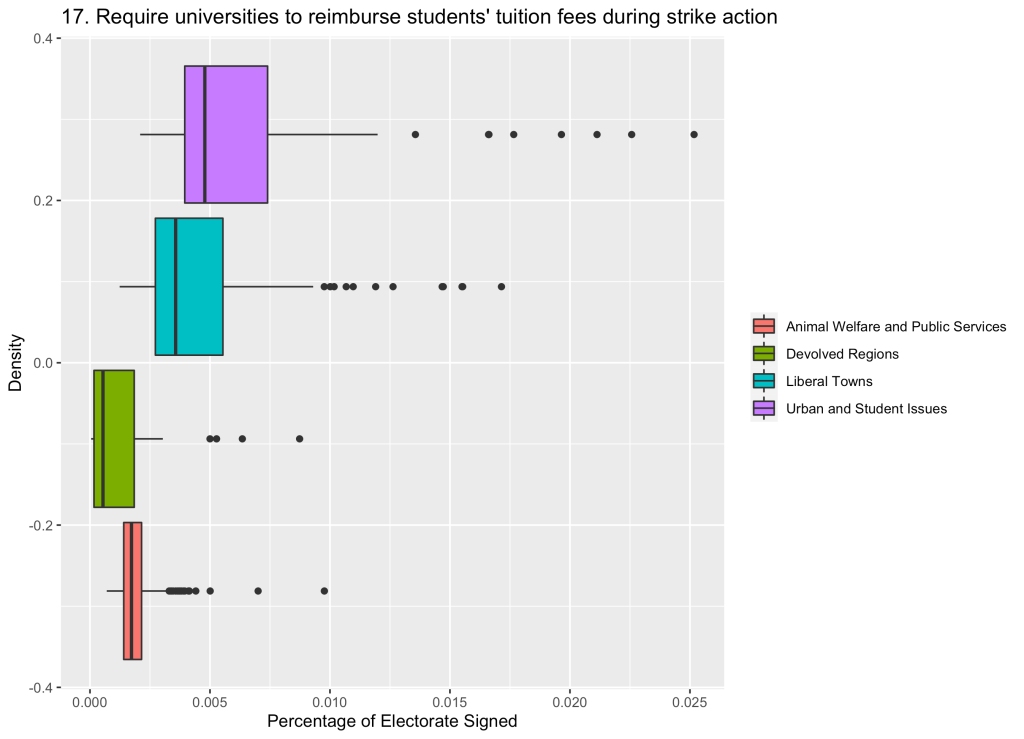
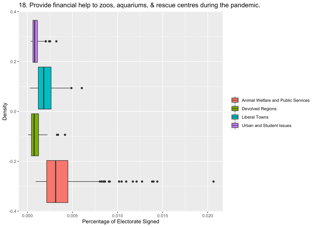
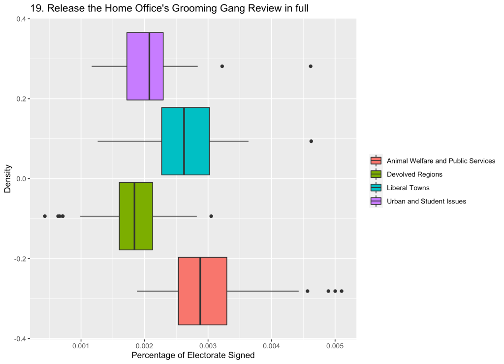
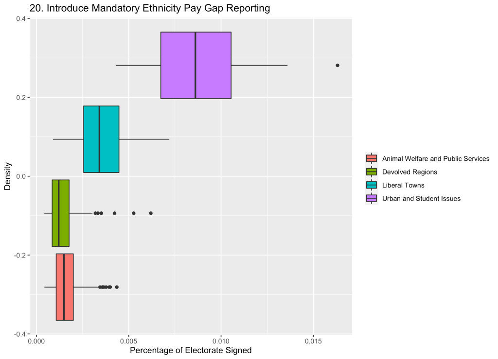
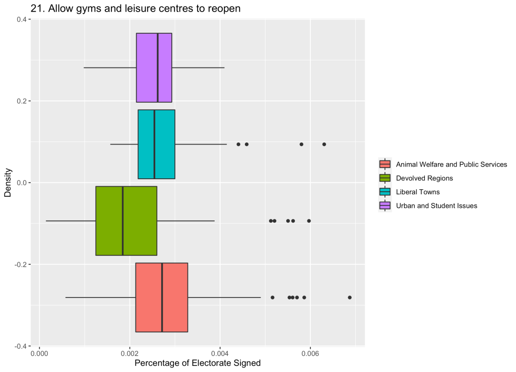
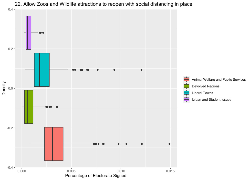
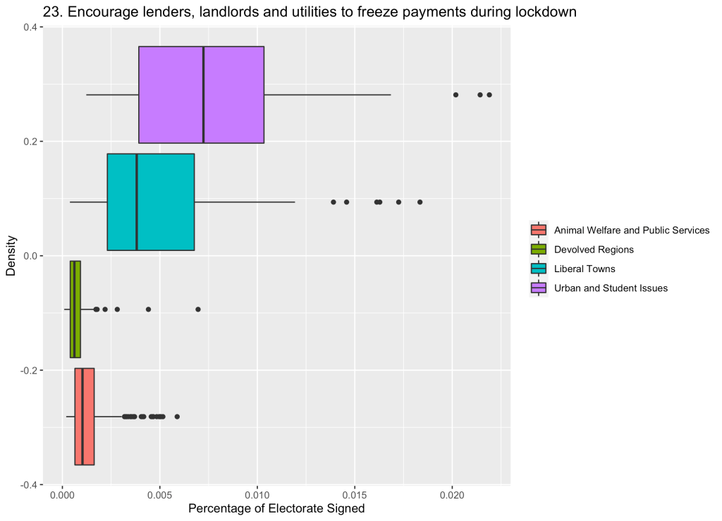
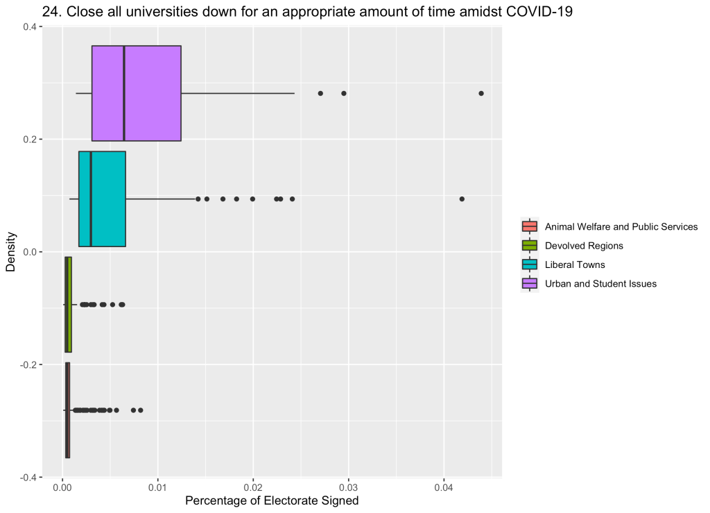
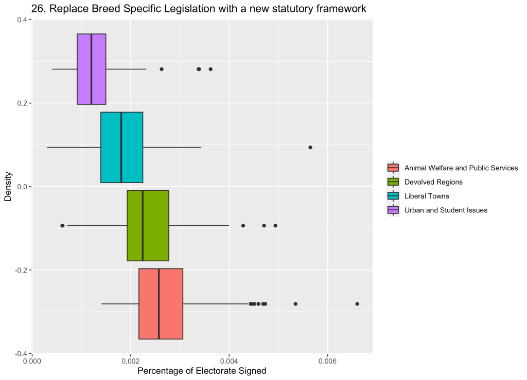
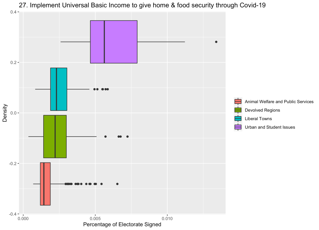
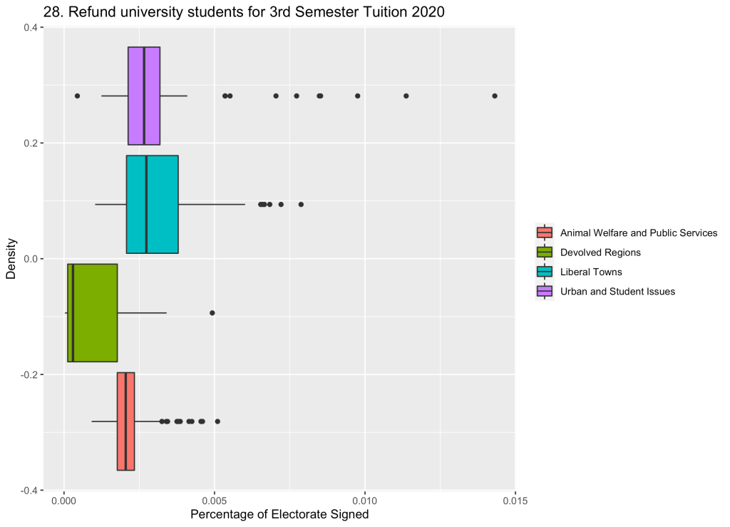
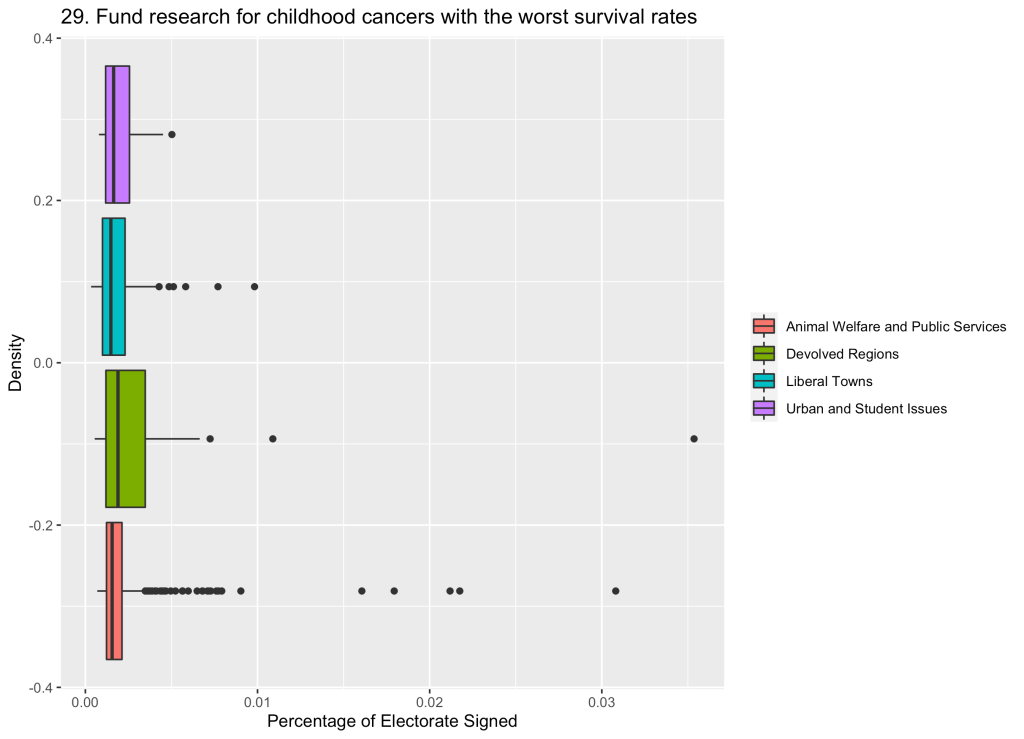
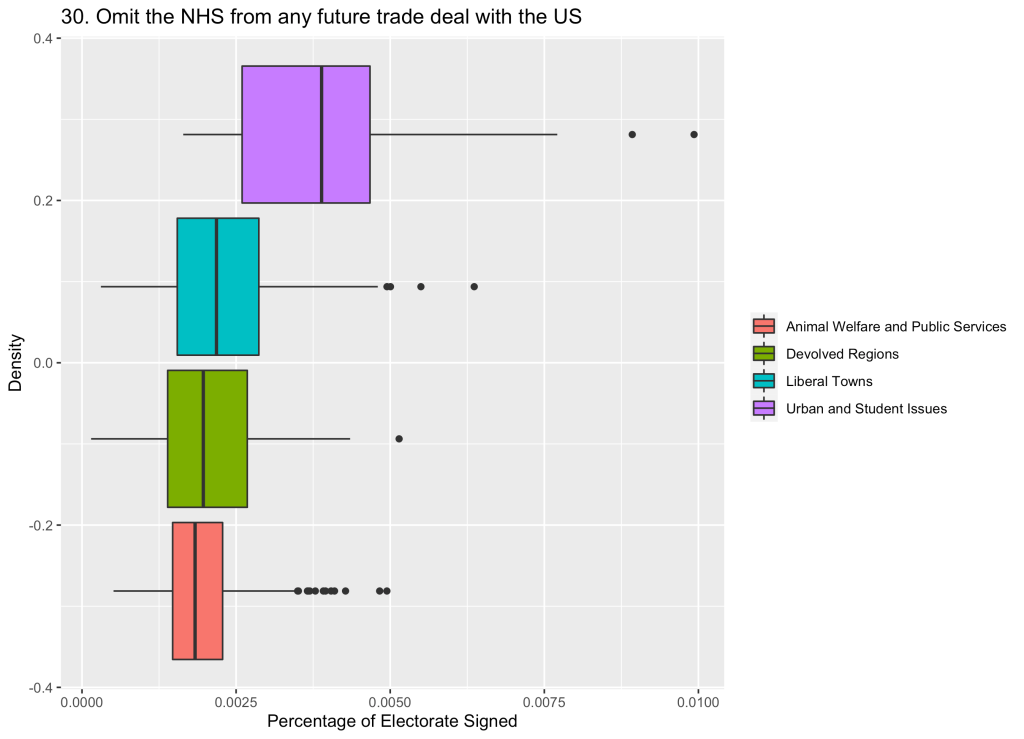
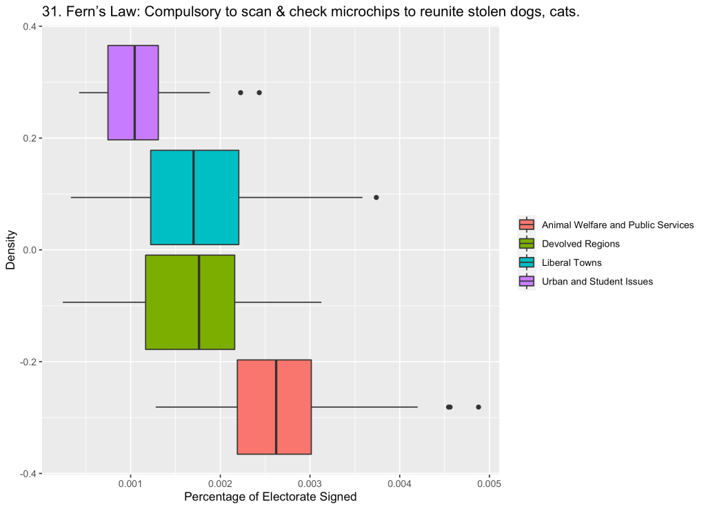
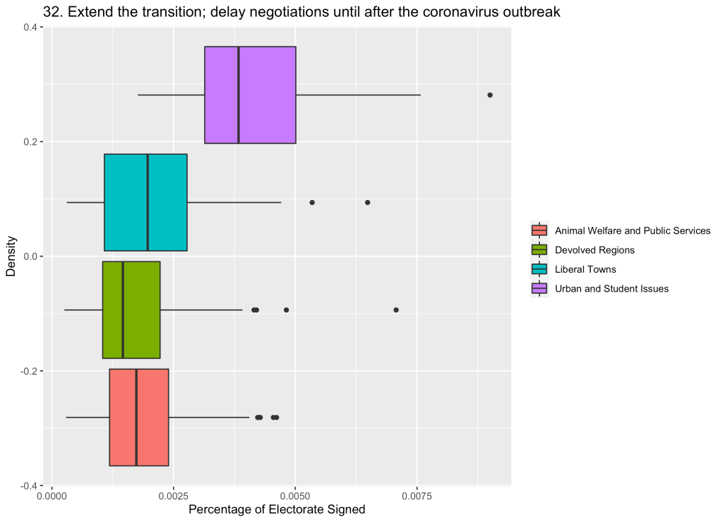
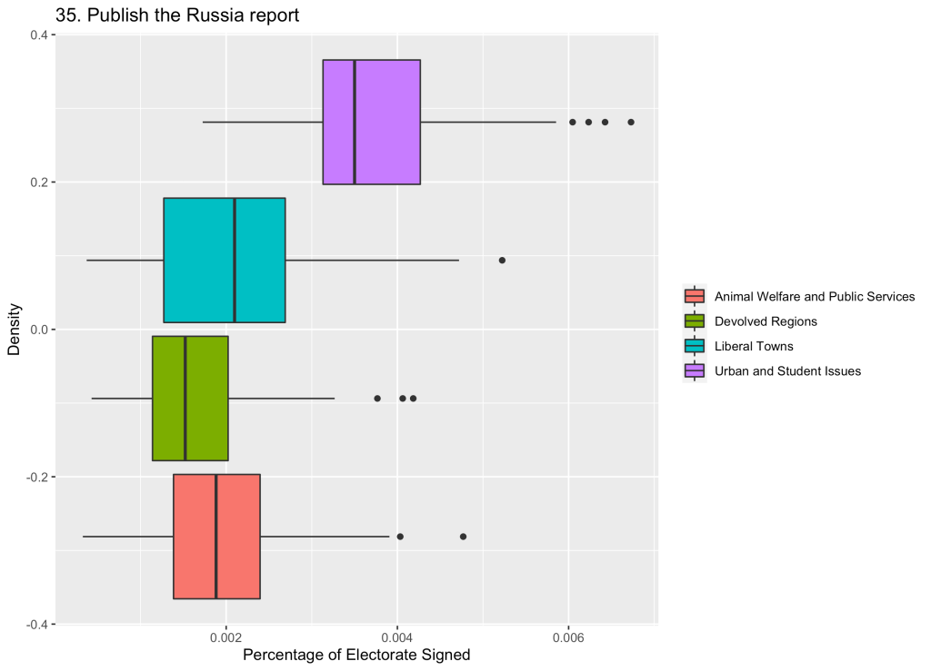
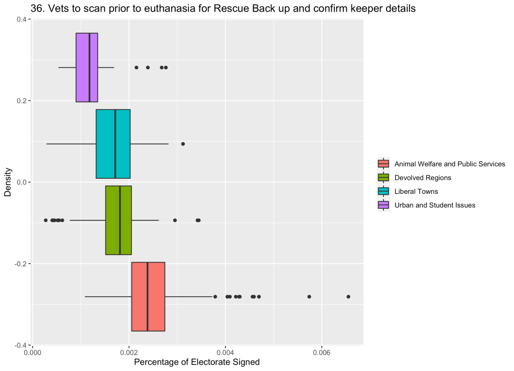
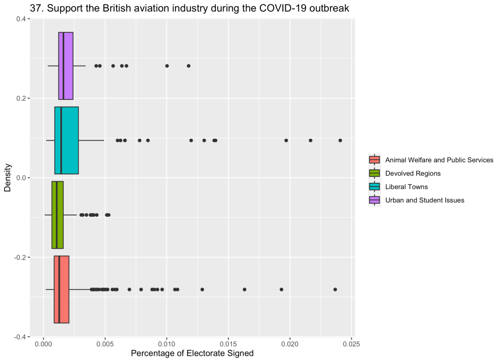
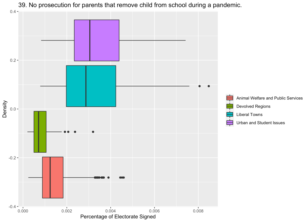
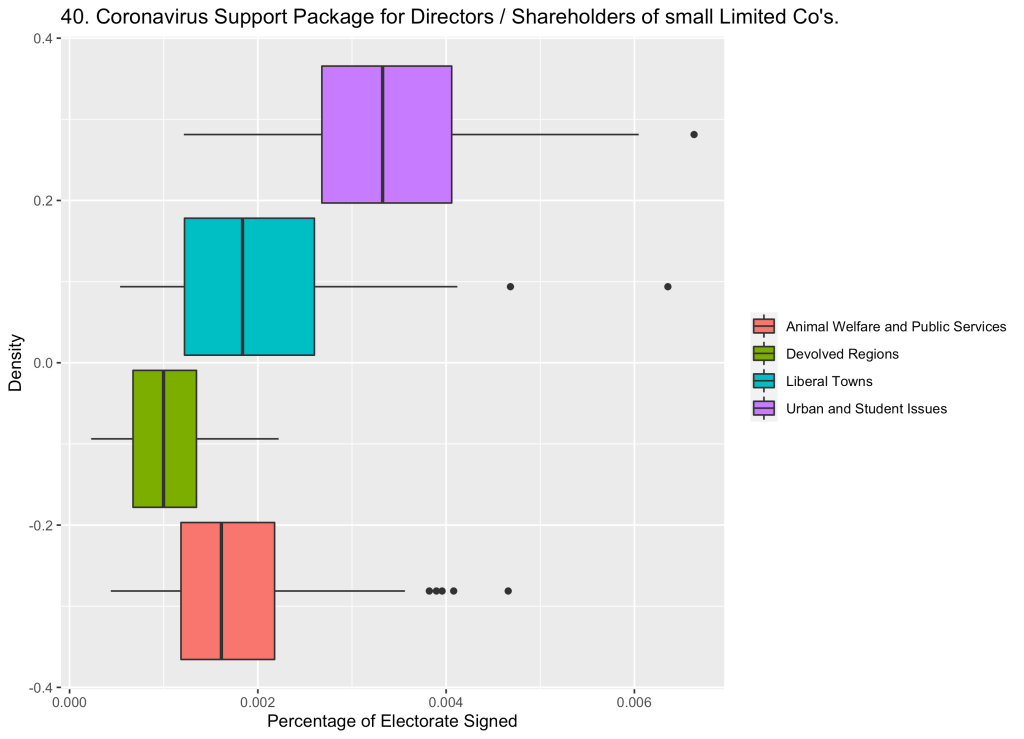
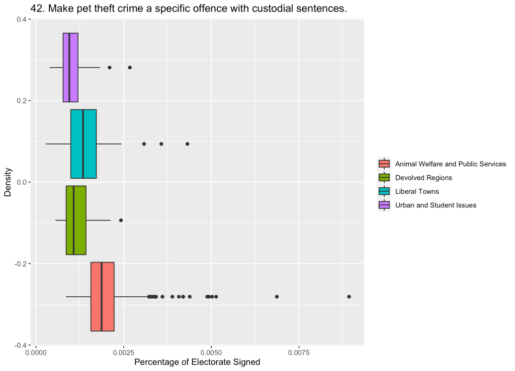
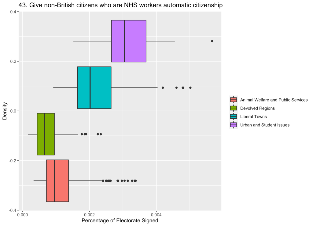
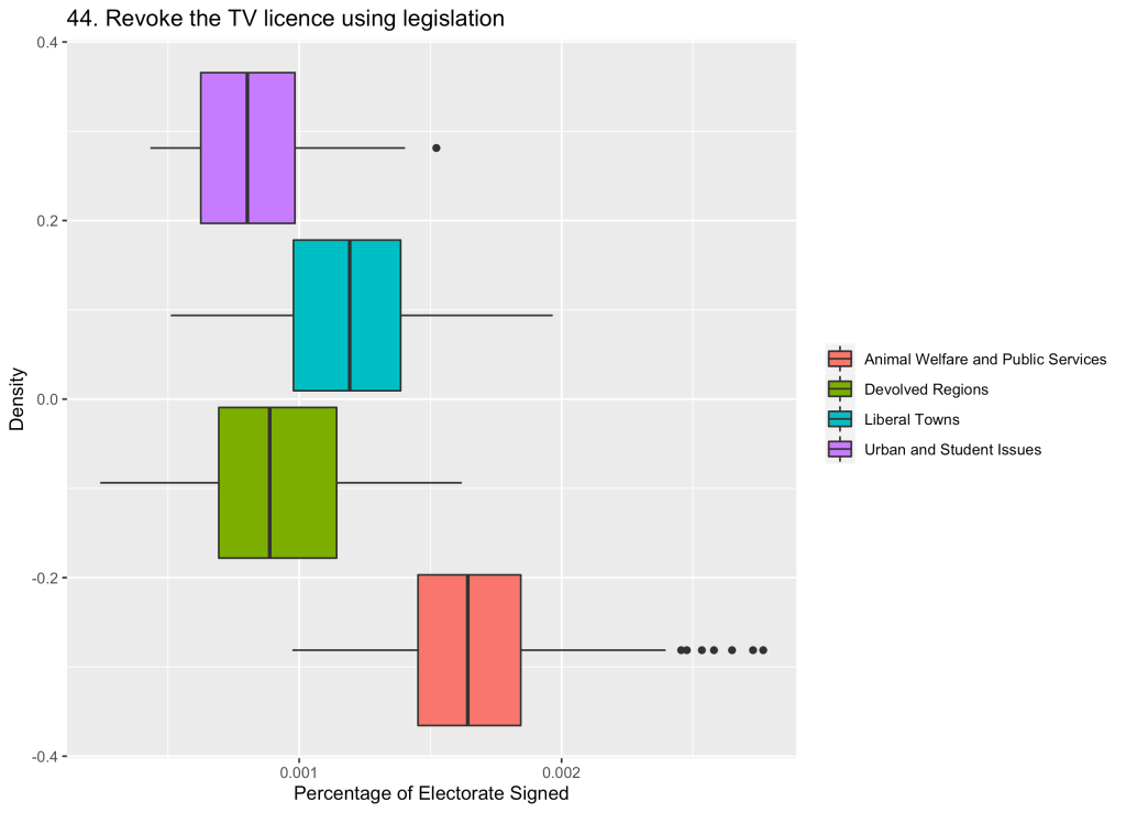
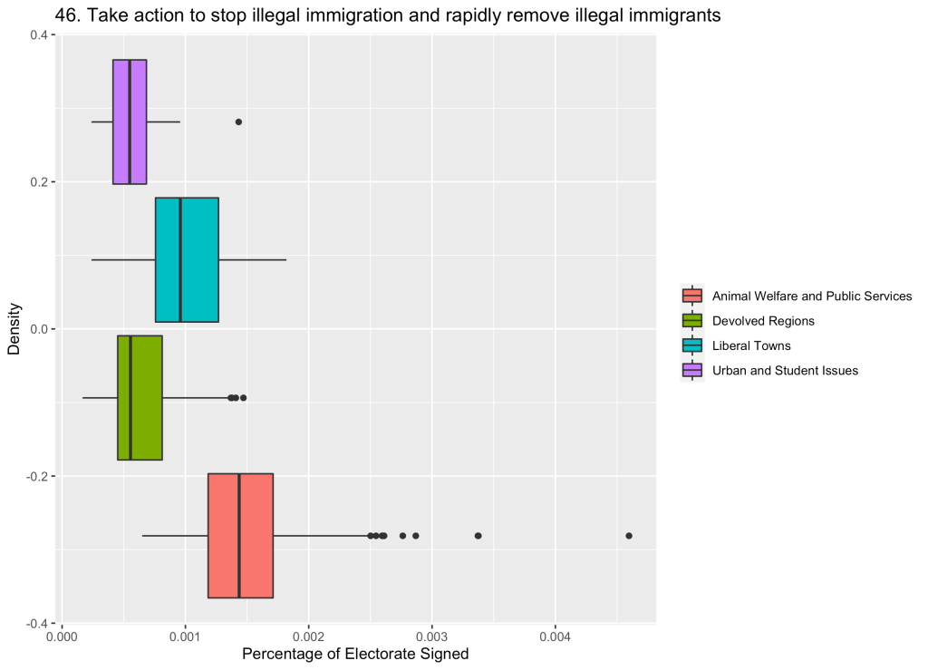
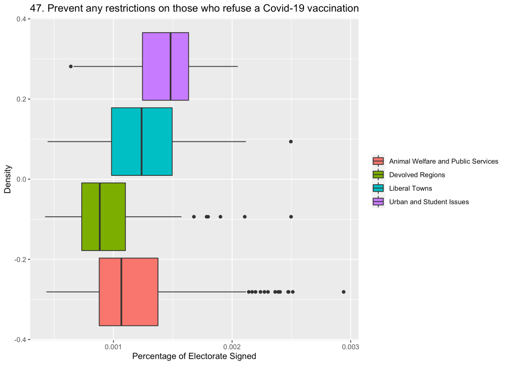
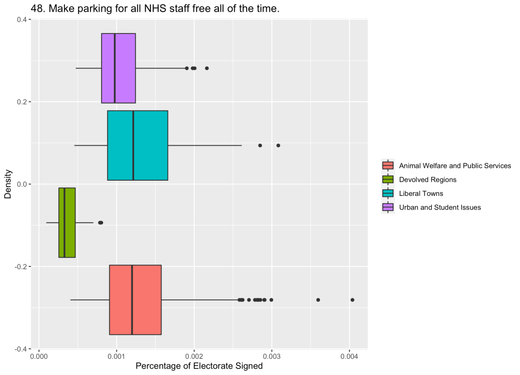
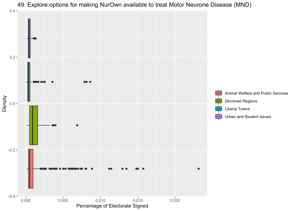
So, how do these clusters compare on the petitions? Box plots for all 50 are below.
Some of the noticeable ones are 15 – a high score for Liberal Towns and virtually no signatures from regions where education is devolved, 3 – in which urban areas (particularly central London) expressed concern about Coronavirus before the lockdown was imposed, 31 – one of the animal welfare petitions that Cluster 3 was named for, and 25 – one of only petitions for which the Devolved Regions group had the highest number of signatures.


Finally, out of interest, I looked at the most prominent petitions in each constituency (that is, the petition which over-performed most in that constituency relative to others). The map to explore this data is here.
There are lots of patterns to be found on the map but I spotted two interesting ones from a quick look. Firstly, the higher number of signatures for “Support the British aviation industry during the COVID-19 outbreak” around Heathrow and Gatwick:

And secondly, higher number of signatures for “Take action to stop illegal immigration and rapidly remove illegal immigrants” for most of Kent and Thurrock.

There are loads of odd/quirky patterns on the map which I’ve probably missed so check them out here and here and let me know!
*Clark, Lomax and Morris use a Gaussian Mixture Model (GMM) to find their clusters, so this isn’t a perfect like for like comparison. I found that because GMM uses soft classification (giving a finite probability that each constituency will belong to a class) and the clusters can be non-spherical, the GMM method made it harder to see some distinctions between clusters in the 2019 Parliament data.

Leave a comment